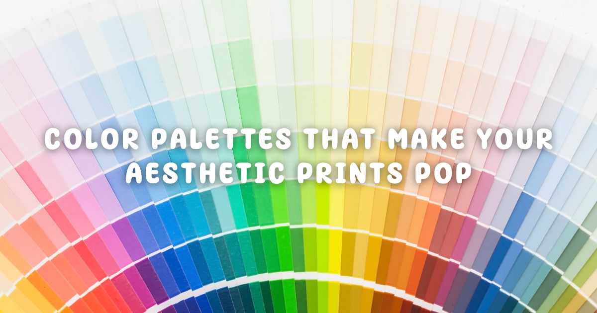
Picking the right print is only half the battle—the secret sauce to truly stunning wall decor? Color pairing. Whether you’re aiming for a calming retreat or a dynamic vibe, the colors in your room need to work with your art, not against it.
In this post, we’re breaking down how to choose aesthetic color palettes that make your aesthetic prints pop, elevate your space, and feel oh-so-intentional. Let’s give your walls the glow-up they deserve.
Why Color Pairing Matters
Color impacts how we feel. That’s not just design talk—it’s science. Color psychology shows that certain shades can soothe, energize, inspire, or even spark creativity.
“When your art and your space speak the same color language, magic happens.”
Misaligned aesthetic color palettes can make even the most beautiful print look off. But with just a bit of planning, you can create color harmony that ties your whole room together.
The Color Psychology Cheat Sheet
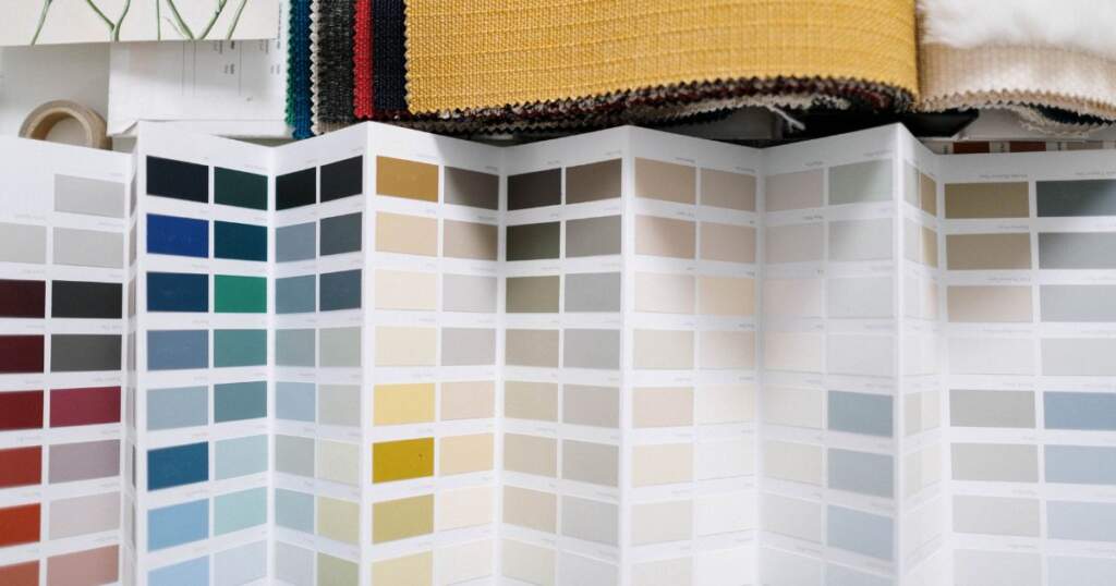
How you use aesthetic color palettes can evoke emotion and feelings. Here’s a list of some color palettes and their emotional influence over your mood.
- Blues & Greens: Calm, focus, restfulness
- Pinks & Peaches: Compassion, warmth, creativity
- Yellows & Oranges: Energy, happiness, motivation
- Grays & Neutrals: Stability, softness, simplicity
- Black & White: Bold contrast, drama, clarity
Match Made in Heaven: Print + Palette Pairings
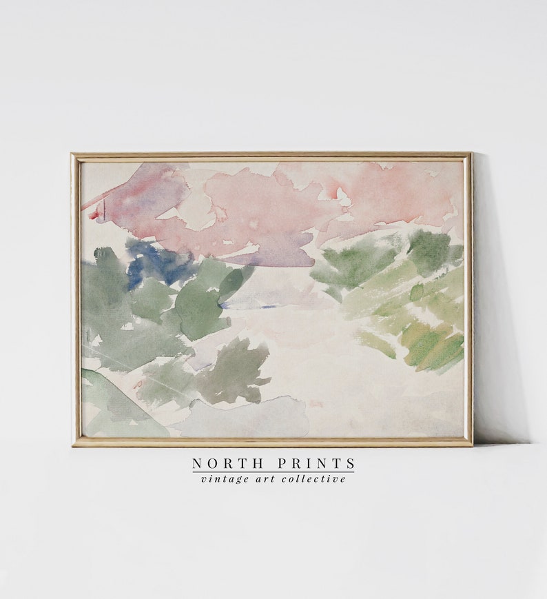
1. Muted Abstracts + Sage + Clay + White
Soft-toned abstract prints look stunning against earthy wall palettes. Add linen curtains, a woven rug, and terracotta planters for a total mood.
Best for: Living rooms, bedrooms, or neutral-toned homes
2. Line Art Faces + Blush + Dusty Blue + Black Accents
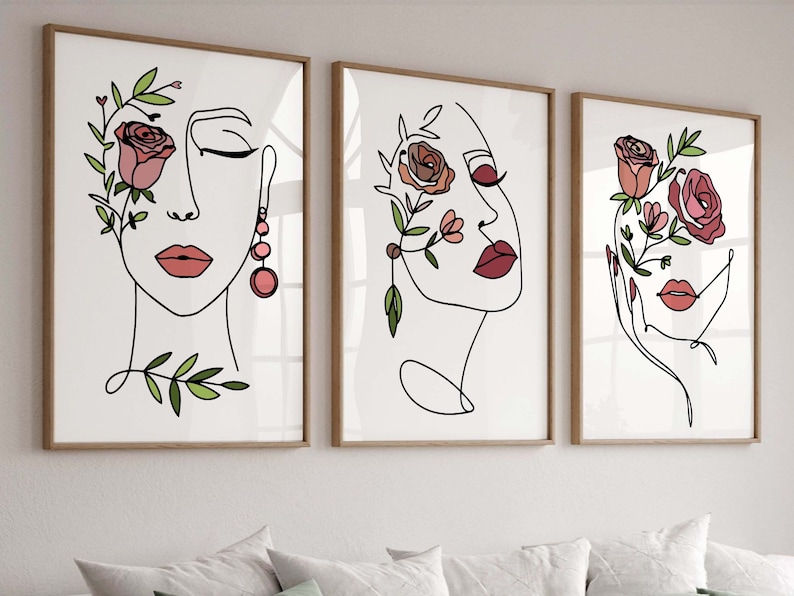
Minimalist black line prints sing when paired with soft tones and dark frames. Think Parisian chic meets modern calm.
Best for: Entryways, hallways, or home offices
3. Typography Posters + Mustard + Teal + Bright White
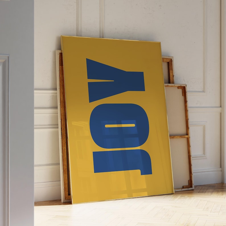
Let your bold words shine against confident colors. Use high-contrast combos to turn quotes into centerpieces.
Best for: Kitchens, offices, or creative spaces
4. Floral Boho Prints + Terracotta + Forest Green + Cream
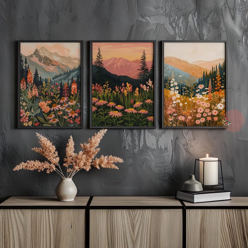
Vintage-inspired botanical prints look luxe with earthy jewel tones and soft creams. Pair with other floral, metal, or wooden elements for the full nature look.
Best for: Bedrooms, sunrooms, or gallery walls
“It’s not about matching—it’s about connecting the dots between your print and your palette.”
Framing for Color Harmony
Don’t underestimate the power of a frame. It can either complete your palette or compete with it. Use these tips below as a blueprint for mapping out framing.
Tips:
- White frames = clean and gallery-like
- Black frames = contrast and definition
- Wood frames = warmth and cohesion with natural tones
- Gold/metallic frames = glam or vintage touches
What to Avoid When Using Aesthetic Color Palettes
Even gorgeous art can lose impact if it fights with the room. Watch out for:
- Too much of one tone: Avoid overly monochrome spaces without accent contrast
- Clashing warmth/coolness: Pair warm prints with warm decor, and same for cool
- Ignoring lighting: Natural light brings out different tones than warm artificial lighting
“Color is a vibe. Use it wisely, and your space becomes a whole experience.”
Final Thoughts
Choosing the right aesthetic color palette doesn’t mean repainting your entire home. Small tweaks to accessories and thoughtful pairing with prints can completely transform how your space looks and feels.
Whether you lean minimalist or maximalist, soft or bold, understanding your palette is the key to letting your aesthetic prints truly shine.
Ready to pair like a pro? Browse some Color-Curated Print Collections on Etsy and start building a space that looks as good as it feels.


